CSS3之3D转换
文章目录
- 一、3D移动translate3d
- 二、perspective(透视)
- 三、translateZ
- 四、rotateX-rotateY-rotateZ
- 五、rotate3d(x,y,z,deg)
- 六、3D呈现transfrom-style
- 七、旋转木马案例
一、3D移动translate3d
3D移动在2D移动的基础上多加了一个可以移动的方向,就是z轴方向
 - transform:translateX(100px) ===> 仅仅在x轴上移动
 - transform:translateY(100px) ===> 仅仅在y轴上移动
 - transform:translateZ(100px) ===> 仅仅在z轴上移动
 - transform:translate3d(x,y,z) ===> x,y,z代表要移动的方向
二、perspective(透视)
- 写到被观察盒子的父盒子上
- 模拟人眼观察目标物体的距离
    body{
        perspective: 1000px;
    }
    div{
        width: 200px;
        height: 200px;
        background-color: blueviolet;
        margin: 0% auto;
        transform: translate3d(100px,100px,100px);
    }
</style>
<body>
    <div>1</div>
三、translateZ
Z轴值越大,目标物体就越大
<style>
    body{
        perspective: 500px;
    }
    div{
        width: 100px;
        height: 100px;
        margin: 0% auto;
        background-color: antiquewhite;
        transform: translateZ(100px);

    }
</style>
<body>
    <div>
        1
    </div>
四、rotateX-rotateY-rotateZ
沿着X,Y,Z轴旋转
<style>
    body{
        perspective: 500px;
    }
    div:hover{
        transform: rotateZ(360deg);
        transform: rotateY(360deg);
        transform: rotateZ(360deg);
    }
    div{
        height: 200px;
        width: 200px;
        display: block;
        background-color: aquamarine;
        margin:100px auto;
        transition: all 2s;
    }

</style>
<body>
    <div>123</div>
</body>
五、rotate3d(x,y,z,deg)
沿着自定义轴旋转deg为角度
<style>
    body{
        perspective: 500px;
    }
    div:hover{
        transform: rotate3d(1,0,1,360deg);
        transform: rotate3d(1,1,0,360deg);
        transform: rotate3d(0,1,1,360deg);
    }
    div{
        height: 200px;
        width: 200px;
        display: block;
        background-color: aquamarine;
        margin:100px auto;
        transition: all 2s;
    }
</style>
<body>
    <div>123</div>
</body>
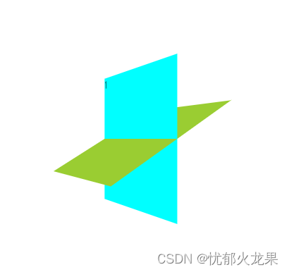
六、3D呈现transfrom-style
 - 控制子元素是否开启三维立体环境
 - transform-style:flat子元素不开启3d立体空间默认的
 - transform-style:perserce-3d;子元素开启立体空间
 - 代码写给父级,但是影响的是子盒子
<style>
    body{
        perspective: 500px;
    }
    .father{
        height: 200px;
        width: 200px;
        position: relative;
        margin: 100px auto;
        transform-style: preserve-3d;
        transition: all 2s;
    }
    .father:hover{
        transform: rotateY(360deg);
    }
    .father div{
        width: 100%;
        height: 100%;
        position: absolute;
        background-color: aqua;
    }
    .father div:last-child{
        background-color: yellowgreen;
        transform: rotateX(60deg);
    }
</style>
<body>
    <div class="father">
        <div>1</div>
        <div>2</div>
    </div>
</body>
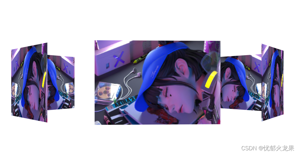
七、旋转木马案例
<!DOCTYPE html>
<html lang="en">
<head>
    <meta charset="UTF-8">
    <meta http-equiv="X-UA-Compatible" content="IE=edge">
    <meta name="viewport" content="width=device-width, initial-scale=1.0">
    <title>Document</title>
</head>
<style>
    body{
        perspective: 1500px;
    }
    section{
        position: relative;
        width: 300px;
        height: 200px;
        margin: 200px auto;
        transform-style: preserve-3d;
        /* background-color: yellowgreen; */
        animation: rotate 3s linear infinite;
    }
    section:hover{
        animation-play-state: paused;
    }
    @keyframes rotate{
        0%{
            transform: rotateY(0);
        }
        100%{
            transform: rotateY(360deg);
        }
    }
    section div{
        position: absolute;
        top: 0%;
        left: 0%;
        width: 100%;
        height: 100%;
        background-image: url(./img/赛博朋克.jpg);
        background-size: 100% 100%;
        background-repeat: no-repeat;
    }
    section div:nth-child(1){
        transform: rotateY(0deg) translateZ(400px)
    }
    section div:nth-child(2){
        transform: rotateY(60deg) translateZ(400px)
    }
    section div:nth-child(3){
        transform: rotateY(120deg) translateZ(400px)
    }
    section div:nth-child(4){
        transform: rotateY(180deg) translateZ(400px)
    }
    section div:nth-child(5){
        transform: rotateY(240deg) translateZ(400px)
    }
    section div:nth-child(6){
        transform: rotateY(300deg) translateZ(400px)
    }
</style>
<body>
    <section>
        <div>1</div>
        <div>2</div>
        <div>3</div>
        <div>4</div>
        <div>5</div>
        <div>6</div>
    </section>
</body>
</html>